FREELANCE
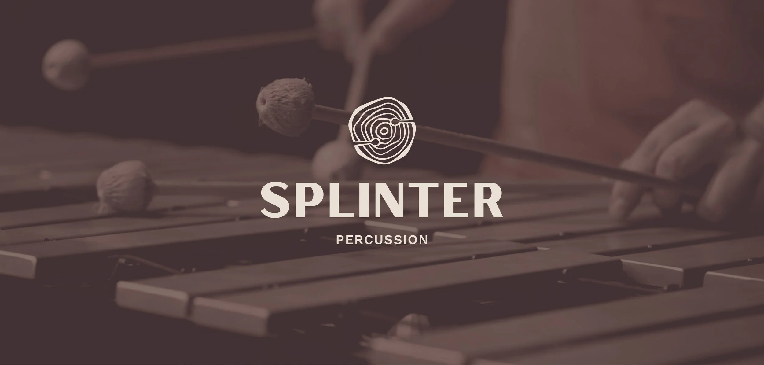
Splinter Percussion
Logo Design | Visual identity
Senior Graphic Designer: Eliza Young
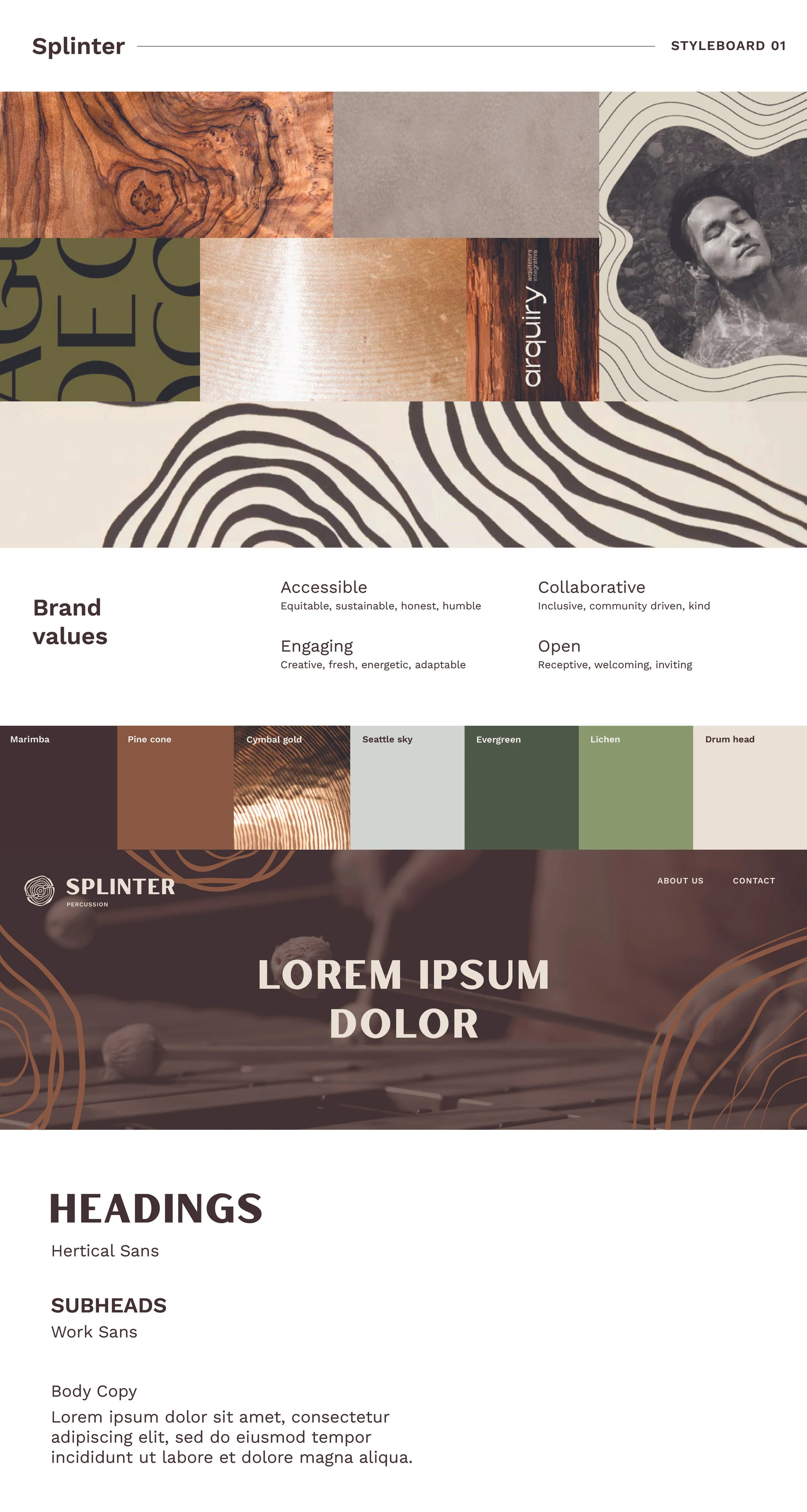
Splinter Percussion is a non-profit organization with the mission to bring the Seattle community together through accessible chamber music. They hired me to create a brand for them that highlighted their collaborative goal in addition to their PNW roots and attention to percussion. Through an intensive brand lab that required the founding members to think outside of the box, we were able to narrow down their brand platform to these key words: accessible, collaborative, engaging, and open.
From there I was able to create their own distinctive visual language that included references to trees from the PNW as well as wood, the material of mallets. I also added waves to nod at reverberating sound, the patterns found in drumheads, and in the wood of the drum frames themselves.


A NOTCH IN WOOD
+

MALLETS ON CYMBALS
+

THE LETTER “S”